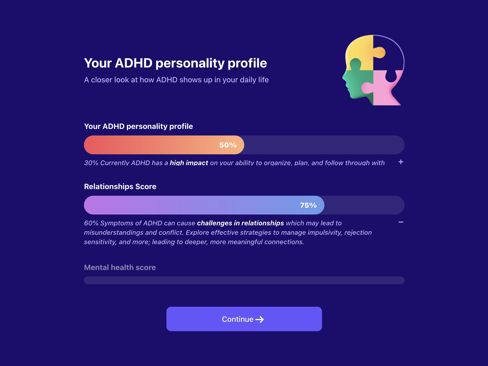
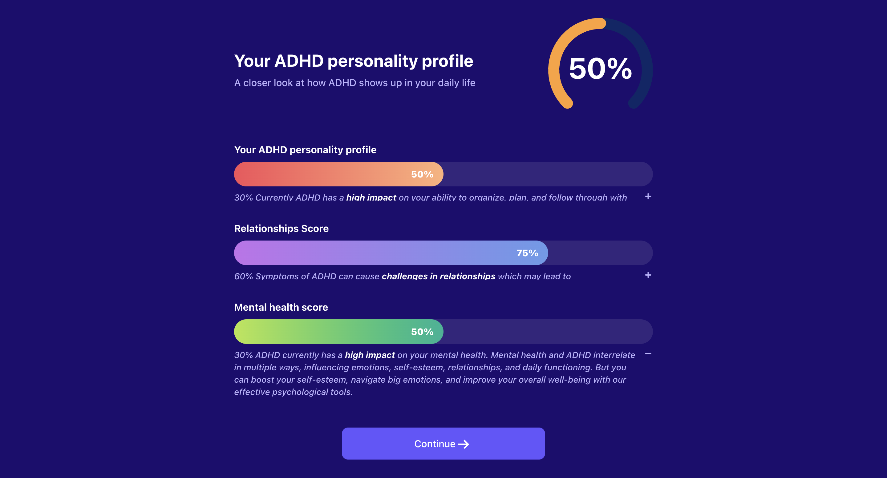
Personalized Profile with Progress Bar
A dynamic onboarding step component that displays a personalized profile with multiple progress bars. Features a header section with title, subtitle, and optional image or arc progress indicator, followed by multiple progress sections that can be configured to show sequential progression or specific active states. Each progress section includes expandable descriptions and customizable styling. Integrates with the global apps context to store user selections and supports JEXL expressions for dynamic content.
Step Config
| Key | Description | Is Optional? |
|---|---|---|
type | Should be personalizedProfileWithProgressBar to identify this step type. | Required |
stepId | Unique step identifier. | Required |
backgroundColor | The background color of the page. | Optional |
activeBarId | Specific bar ID to activate. If not provided, bars will progress sequentially every 2 seconds. | Optional |
header | The header configuration containing title, subtitle, and optional image or progress percentage (see Header Config section below). | Required |
progressSectionStyle | The progress section style configuration for consistent styling across all progress sections (see Progress Section Style Config section below). | Optional |
progressSections | Array of progress sections to display (see Progress Section Config section below). | Required |
cta | The CTA configuration to be added (see CTA Config section below). | Required |
Header Config
| Key | Description | Is Optional? |
|---|---|---|
title | Title text to show at the top of the step. | Required |
titleColor | Title text color. | Optional |
subtitle | Subtitle text to show below the title. Can be a string or object mapping progress values to description text. Keys are progress thresholds, values are description text. | Required |
subtitleColor | Subtitle text color. | Optional |
image | URL to an image to display in the header. Mutually exclusive with progressPercentage. | Optional |
progressPercentage | The progress percentage configuration for an arc progress indicator (see Progress Percentage Config section below). Mutually exclusive with image. | Optional |
Progress Percentage Config
| Key | Description | Is Optional? |
|---|---|---|
value | JEXL expression to calculate the progress percentage value. | Required |
defaultValue | Default progress percentage value if JEXL expression fails. | Required |
textColor | Text color for the percentage display. | Optional |
color | Fill color for the arc progress indicator. | Optional |
backgroundColor | Background color for the arc progress indicator. | Optional |
Progress Section Style Config
| Key | Description | Is Optional? |
|---|---|---|
titleColor | Default color for progress section titles when inactive. | Optional |
titleActiveColor | Color for progress section titles when active. | Optional |
descriptionColor | Color for progress section descriptions. | Optional |
Progress Section Config
| Key | Description | Is Optional? |
|---|---|---|
barId | Unique identifier for the progress bar section. | Required |
title | Title text for the progress section. | Required |
description | Object mapping progress values to description text. Keys are progress thresholds, values are description text. Description text supports JEXL as placeholder. Add placeholder as the following example {{user.getOnboardingAnswer('')}} | Required |
progress | JEXL expression to calculate the progress value for this section. | Required |
defaultProgress | Default progress value if JEXL expression fails. | Required |
progressBarBackgroundColor | Background color for the progress bar. | Optional |
progressBarActiveBackgroundColor | Active/fill color for the progress bar. | Optional |
progressBarTextColor | Text color for the progress bar. | Optional |
CTA Config
| Key | Description | Is Optional? |
|---|---|---|
text | CTA text. | Required |
textColor | CTA text color. | Optional |
backgroundColor | The background color of the CTA button. | Optional |
wrapperBackgroundColor | The background color of the CTA wrapper container for mobile view. | Optional |
Example
PersonalizedProfileWithProgressBar
{
  "stepId": "personalized_profile_progress",
  "type": "personalizedProfileWithProgressBar",
  "backgroundColor": "#151729",
  "activeBarId": "sleep_quality",
  "header": {
    "title": "Your Personalized Well-being Profile",
    "titleColor": "#FFFFFF",
    "subtitle": "Based on your responses, here's your current well-being status",
    "subtitleColor": "#B3C0DD",
    "progressPercentage": {
      "value": "context.overallProgress || 0",
      "defaultValue": 65,
      "color": "#4CAF50",
      "backgroundColor": "#2E7D32"
    }
  },
  "progressSectionStyle": {
    "titleColor": "#9E9E9E",
    "titleActiveColor": "#FFFFFF",
    "descriptionColor": "#B3C0DD"
  },
  "progressSections": [
    {
      "barId": "sleep_quality",
      "title": "Sleep Quality",
      "description": {
        "0": "Poor sleep habits detected",
        "30": "Some sleep issues identified",
        "60": "Moderate sleep quality",
        "90": "Good sleep patterns"
      },
      "progress": "context.sleepScore || 0",
      "defaultProgress": 75,
      "progressBarBackgroundColor": "#374151",
      "progressBarActiveBackgroundColor": "#10B981",
      "progressBarTextColor": "#FFFFFF"
    },
    {
      "barId": "stress_level",
      "title": "Stress Management",
      "description": {
        "0": "High stress levels detected",
        "40": "Moderate stress management",
        "70": "Good stress coping skills",
        "100": "Excellent stress management"
      },
      "progress": "context.stressScore || 0",
      "defaultProgress": 60,
      "progressBarBackgroundColor": "#374151",
      "progressBarActiveBackgroundColor": "#F59E0B",
      "progressBarTextColor": "#FFFFFF"
    },
    {
      "barId": "energy_level",
      "title": "Energy Levels",
      "description": {
        "0": "Low energy levels",
        "50": "Moderate energy",
        "80": "Good energy levels",
        "100": "High energy and vitality"
      },
      "progress": "context.energyScore || 0",
      "defaultProgress": 85,
      "progressBarBackgroundColor": "#374151",
      "progressBarActiveBackgroundColor": "#3B82F6",
      "progressBarTextColor": "#FFFFFF"
    }
  ],
  "cta": {
    "text": "Continue to Recommendations",
    "textColor": "#19223E",
    "backgroundColor": "#B3C0DD",
    "wrapperBackgroundColor": "#151729"
  }
}
Key Features
- Dynamic Progress Calculation: Uses JEXL expressions to calculate progress values dynamically based on user context
- Sequential Progression: When no activeBarId is specified, progress bars activate sequentially every 2 seconds
- Expandable Descriptions: Each progress section includes collapsible descriptions that show based on progress thresholds
- Responsive Design: Adapts to mobile and desktop screen sizes with appropriate styling
- Arc Progress Indicator: Optional circular progress indicator in the header for overall progress visualization
- Customizable Styling: Extensive color and styling options for all components
- Context Integration: Seamlessly integrates with the global apps context for data persistence
Behavior Notes
- Progress sections automatically expand their descriptions when they become active
- Previous progress bars remain visible but in a collapsed state
- The component supports both automatic sequential progression and manual
activeBarIdspecification - JEXL expressions are evaluated for both header progress percentage and individual section progress values
- Descriptions are shown based on progress thresholds, with the highest applicable threshold being displayed