Question Date Picker
questionDatePicker is a template to be used with asking users to pick a date.
| Key | Notes |
|---|---|
type | questionDatePicker |
stepId | Unique step id |
title | The title of the template |
subtitle | The subtitle text |
label | The label of the date picker e.g Pick a date |
defaultDateOffsetDays | The start date of the calendar. For example, if it’s 80, the calendar will show the start date as 80 days in the future. |
minDateOffsetDays | The minimum date that the user can pick. If it’s 30 for example the user will only be able to pick a date starting 30 days in the funture. |
labelTextColor | The text color of the label |
iconColor | The calender icon color |
inputTextColor | The data picker input text color. |
inputBackgroundColor | The data picker input background color. |
inputBackgroundHoverColor | The bg color of the input on hover |
backgroundColor | The step’s background color |
textColor | The step main text color |
ctaText | The CTA text e.g Continue |
ctaTextColor | The CTA text color |
ctaBackgroundColor | The CTA background color |
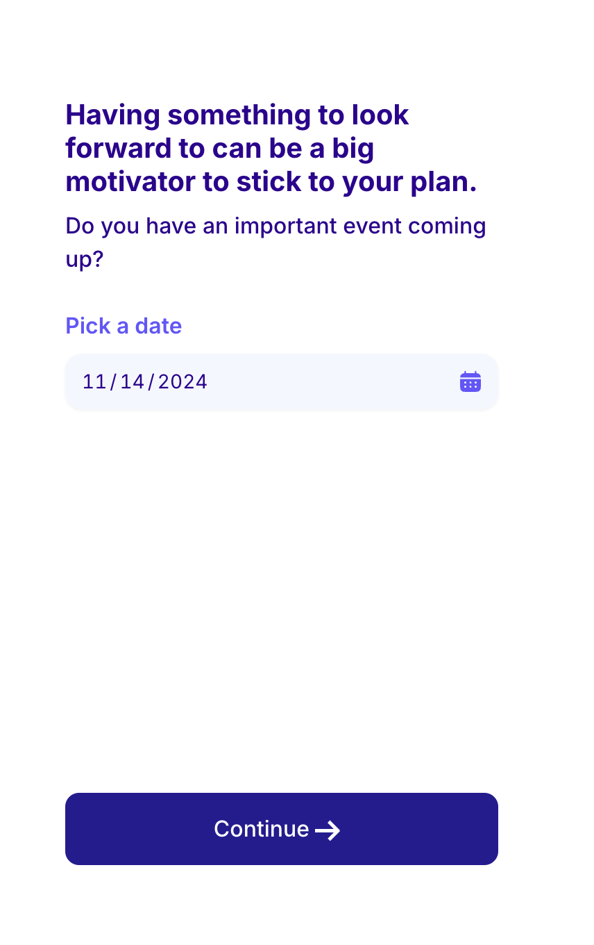
A step example
{
    "type": "questionDatePicker",
    "title": "Having something to look forward to can be a big motivator to stick to your plan.",
    "stepId": "occasion_when",
    "subtitle": "Do you have an important event coming up?",
    "key": "occasion_when",
    "backgroundColor": "#ffffff",
    "textColor": "#2F0191",
    "ctaText": "Continue",
    "ctaTextColor": "#FFF",
    "ctaBackgroundColor": "#251C93",
    "label": "Pick a date",
    "iconColor": "#6455FE",
    "inputTextColor": "#2F0191",
    "inputBackgroundColor": "#f5f7ff",
    "labelTextColor": "#6455FE"
}