Question Scale
| Key | Notes |
|---|---|
type | questionScale |
stepId | Unique step id |
mode | Optional, but it supports phone mode to show the steps in a phone mode instead of a full-width on desktop. 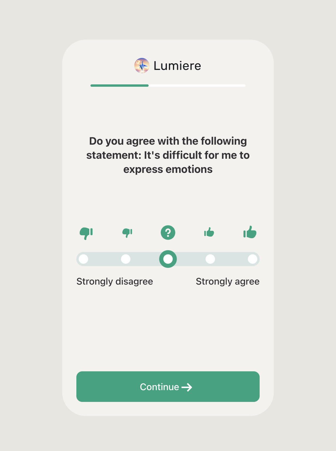 If If mode isn’t specified, the default will show the step in full width:  |
title | The step title |
backgroundColor | |
textColor | The main textColor on the page |
scaleBarColor | The bar color of the scale in the step. |
barIconBackgroundColor | The circle icons background colors. |
selectedBarIconBackgroundColor | The background color of the selected icon. |
selectedBarIconBorderColor | The border color of the selected icon. |
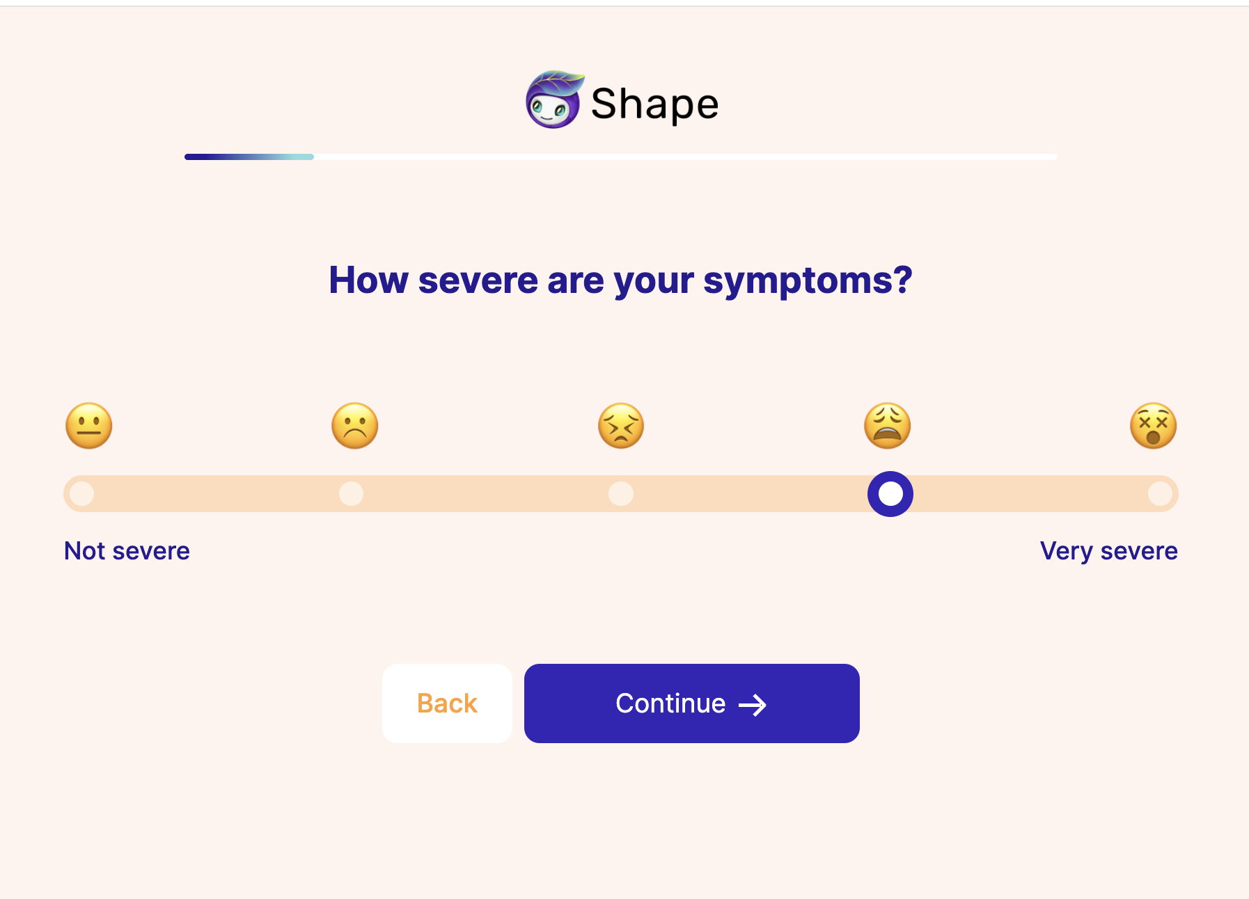
choices | An array for the choices that the user should shows from. "choices": [ { "name": "Not severe", "value": "Not severe", "imageUrl": "https://c.thefab.co/web-onboarding/shape/ibs/icons/9.1.png" }, { "name": "Negative", "value": "Negative", "imageUrl": "https://c.thefab.co/web-onboarding/shape/ibs/icons/9.2.png" }, { "name": "Neutral", "value": "Neutral", "imageUrl": "https://c.thefab.co/web-onboarding/shape/ibs/icons/9.3.png" }, { "name": "Positive", "value": "Positive", "imageUrl": "https://c.thefab.co/web-onboarding/shape/ibs/icons/9.4.png" }, { "name": "Very severe", "value": "Very severe", "imageUrl": "https://c.thefab.co/web-onboarding/shape/ibs/icons/9.5.png" } ] NOTE: Only the text of the first and last of the scale options will be visible on the step (check the screenshot below). However, all the name and value of the step are always required and they must be unique. |
ctaText | The text of the main button |
ctaColor | The text color of the main button |
ctaBackgroundColor | The background color of the main button |
ctaHoverBackgroundColor | The background of the main button on hovering. |
backButtonColor | The text color of the back button |
backButtonText | The text of the back button |
backButtonBackgroundColor | The background color of the back button |
Example:
{
    "type": "questionScale",
    "stepId": "step_9",
    "title": "How severe are your symptoms?",
    "backgroundColor": "#FFF4EE",
    "scaleBarColor": "rgba(255, 161, 51, 0.3)",
    "barIconBackgroundColor": "rgba(255, 255, 255, 0.60)",
    "selectedBarIconBackgroundColor": "#FFF",
    "selectedBarIconBorderColor": "#3425B8",
    "textColor": "#251C93",
    "ctaText": "Continue",
    "ctaColor": "#FFF",
    "ctaBackgroundColor": "#3425B8",
    "ctaHoverBackgroundColor": "#2A1E93",
    "backButtonColor": "#FFA133",
    "backButtonText": "Back",
    "backButtonBackgroundColor": "#FFF",
    "choices": [
        {
            "name": "Not severe",
            "value": "Not severe",
            "imageUrl": "https://c.thefab.co/web-onboarding/shape/ibs/icons/9.1.png"
        },
        {
            "name": "Negative",
            "value": "Negative",
            "imageUrl": "https://c.thefab.co/web-onboarding/shape/ibs/icons/9.2.png"
        },
        {
            "name": "Neutral",
            "value": "Neutral",
            "imageUrl": "https://c.thefab.co/web-onboarding/shape/ibs/icons/9.3.png"
        },
        {
            "name": "Positive",
            "value": "Positive",
            "imageUrl": "https://c.thefab.co/web-onboarding/shape/ibs/icons/9.4.png"
        },
        {
            "name": "Very severe",
            "value": "Very severe",
            "imageUrl": "https://c.thefab.co/web-onboarding/shape/ibs/icons/9.5.png"
        }
    ]
}